|
9/18/2018 4 Comments A Rhetorical analysisShakespeare’s Staging — a digital archive developed by Hugh Richmond, containing materials from his time with the Berkeley Shakespeare Program. Overall, I feel that a few more effective rhetorical and design choices could be made, particularly on the home page, considering that it is an important attention-grabber for any website. However, the overall organization of material seems to be fairly formulated and navigable. AUDIENCE. Their intended audience is to appeal to students and teachers, as referenced in the emphasized header under the website’s title. However, in the body, it claims that this is a resource for all “Shakespeareans,” meaning anyone with a love of Shakespeare, including “students, scholars, teachers, performers, producers, and general audiences.” This opens the .door to a wide audience, meaning anyone who’s interested; however, under the first tab ‘How To Use This Site,’ the options are solely divided into students, teachers, and researchers. 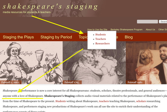 There is definitely more than one intended audience for this site, as noted in the body, so I think they should keep the website options consistent with this claim. If I were simply a “lover of Shakespeare,” I could feel intimidated by this archive upon first glance, if I feel I cannot fit into the student, teacher, or researcher categories. PURPOSE AND GENRE. As for the large-scale purpose of the site, the home page states that the mission is to enrich an understanding of the performance aspects of Shakespeare’s scripts for anyone who’s interested. As noted, this is provided by a collection of audio-visual materials from Shakespeare’s plays at the time of Shakespeare through present times. This explains their mission fairly well. However, under the ‘Goals and Methods’ tab, they explain many more motives of the site. As a viewer, this page seems a little redundant, involving only text, little space, and no visuals. Also, I feel that the information could be more concise. I would be more likely to read about the other goals and methods if it felt easier to read and more approachable.
Upon first glance, this page seems more like a Wikipedia page to me, rather than a compilation of goals and methods. For the viewer’s sake, I would simplify the content and the layout of this page. CONTEXT. The site offers texts categorized by plays, time periods, and topics with a wide variety. Readers will familiarize themselves with the content by reading, viewing images and slideshows, as well as watching videos. The organization of the content is specific to certain aspects of performance, which I think allows the reader to navigate more personally and effectively. AUTHOR. As listed under ‘About Us,’ the site was developed by Hugh Richmond. However, there is also an entire page devoted to Hugh Richmond, containing his biography, publications, awards, references, articles, and archival collection. This allows us as readers to establish credibility with the author, especially since we are provided lengthy and detailed information about him, as well as links to further investigate. In addition to Hugh Richmond, we are provided another page called ‘Site Personnel’ that gives us a breakdown of every person involved with a brief description (i.e. site coordinator, site builder, associate director, assistants, and consultants). As a reader, I feel that this allows me to trust the developers of this site. DESIGN. The home page places a large emphasis on the categories of staging, specifically by play, time period, and topic. They display them on a red ribbon in a large, yellow font. I think this was an effective design choice because it helps the viewer see their options and find their topic of choice more efficiently. I personally wouldn’t have chosen a yellow font color for readability sake, but it does lighten the page in accordance to the brown and dark red. I would suggest updating the color scheme in general to a brighter, more clean aesthetic. Particularly for the smaller navigation bar (About Us, How To Use This Site, etc.,), I feel that the small font size and the yellow color works against each other. I would rethink the layout of the two back-to-back, horizontal navigation bars.  There needs to be a larger contrast between these two elements, since they are crucial to navigating the site. Because they are similar and lie close without space, these two bars blend together in our heads. I personally didn’t take time to notice the smaller navigation bar upon first glance. Although there was a lack of contrast and a space, the photos were a nice visual that helped break up the redundancy of the information on the home page.
HOW CAN THIS HELP US? Overall, I think developers of any website should strive to develop a manageable and approachable site. This website in particular would feel much more approachable if it incorporated more space between elements, larger contrasts, and more concise information. In addition, I think the color scheme should be largely considered. This site’s color scheme was consistent, which was effective, but overall needed more contrast to cater to the reader’s eye. This is a useful reminder for us, that when we create our performance archive, we need to consider how colors, typography, font, positioning, and alignment all work to create a contrast that insinuates the most important information. LINK: Shakespeare’s Staging. Dir. Hugh Macrae Richmond. University of California Berkley. < http://shakespearestaging.berkeley.edu/>.
4 Comments
Chor Yi Lilac To
9/18/2018 07:26:55 pm
Just like what you said, this website provides information in a way too tense. It's like the author is bombarding everything at the same time. I agree that the context should be more concise.
Kathryn Moore
9/19/2018 09:45:14 am
I really liked the layout of your post, from the clear organization to the corresponding visuals. Also, I can tell you really spent time analyzing the website from different angles. For example, I initially didn't think about how the two drop down menu features stacked on top of each other could be a problem, but it's definitely a flaw in the website. Really informative and well done overall!!
Abigail Bowen
9/23/2018 07:50:52 pm
I really enjoyed reading your post! It was very effectivley organized and I definitely got a great sense of how you felt about the Shakespeares Staging site. I agree that we should use more contrasting colors for our digital archive. 2/6/2019 03:00:18 pm
Many thanks for your interest. The criticisms seem mostly of titlepage format, rather than content and efficacy overall. In practice the site has received over nine million page visits by more than three million individuals, so I think its actual effectiveness transcends any issues of local coloration, etc. Still any comment is welcome and helpful. HR Leave a Reply. |
 RSS Feed
