|
10/24/2018 4 Comments sample web page + logo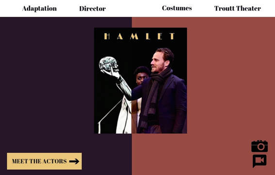 Design Justification
I wanted my logo and web design to be symbolic of the duality represented in Hamlet. As mentioned by professor McDonald, a large component of Hamlet is the divide between who Hamlet is while wearing the mask and who he is without the mask. Rather than simply focusing on the iconic image of the skull, I wanted to spotlight the depth of Hamlet as a character, since this is such a large aspect to the play. In addition to this element, I wanted to portray duality in my design to highlight the "interplay of traditional and new media” (Belmont Folger Shakespeare Grant). I did this by dividing the photo of ‘Hamlet’ from Belmont’s archive into two distinct edits — one being black and white and the other being the current edit of the photo. To highlight the split in Hamlet’s character, I divided the image to further this contrast, as a result of the death of his father (the skull). Although only Belmont and Nashville audiences would recognize the actor in the image, Nashville and global audiences would recognize the symbolic elements of the logo and web page. As for the web design, I wanted to maintain the theme of duality. I did this by splitting two background colors and aligning them to the split in the logo. As for the color scheme of the page, I wanted the colors to tie into the costumes seen in the logo. The content of the webpage is separated into the navigation bar, the ‘Meet The Actors’ button, and the visual icons. I created this proximity to maintain a clean, navigable site, so that viewers could better access a desired page. I also wanted the alignment of the main headings to be consistent with the division of the page. I chose to use icons for the photo and video links to add emphasis to them, as well as highlight that these are visual pages. Overall, I wanted to create a design that’s visually appealing and simple, yet representative of the complex themes and adaptations of Hamlet.
4 Comments
Abigail Bowen
10/29/2018 02:09:16 pm
I love the idea behind the half cartoon version of the image! I think that it is so cool and would be a fun image to have on our website!
Maddie Glanton
10/29/2018 02:18:11 pm
I vote for this website and logo because I think it accurately represents the duality of Hamlet and the uniqueness of the production. It's quirky, yet sinister and I love that. Plus it keeps the color tones of the costumer in mind.
Anna Bates
10/29/2018 02:18:18 pm
I love the color scheme and the idea of a transitioning cartoon picture. It adds a very whimsical element to the site, which I think is important, especially since so many younger people attended. I also love the font choice. It reminds me of Broadway a little bit, while still maintaining the overall aesthetic. Great job!!
Sam Molli
10/29/2018 02:19:13 pm
I really enjoy the logo you created for Hamlet and how you incorporated it into the web design. I think both the web design and logo are simplistic, yet strategically complex in a way that makes it aesthetically pleasing but not overwhelming for the viewer. I feel like both the web design and logo would be great for our website on Hamlet. Leave a Reply. |
 RSS Feed
