 The Story:
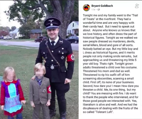
Bryant Goldbach and his 5-year-old son dressed as Nazis for halloween. After receiving backlash from a trunk-or-treat event they attended, Goldbach took to Facebook to comment on how badly him and his son were treated, and followed the post with a photo of them in their costumes. Quickly after, Goldbach’s post went viral. His Facebook comments were filled with derogatory names, comments that questioned his parenting and suggestions that he leave Owensboro. He was publicly shamed as a 'child abuser,' 'racist,' and 'coward' on Facebook, Reddit, and Twitter. As the backlash continued to escalate, Goldbach attempted to justify the costumes by explaining that he chose the costumes for historical purposes, saying “he hadn't really thought the idea through.” However, after being questioned by multiple stations, he did make an apology statement to ABC affiliate WEHT, stating that, “I think it was in bad taste for me to let my child wear that, probably for me to wear that. It didn’t occur to me. “I’m sorry,” Goldbach told the station, “I feel like I’ve hurt a lot of people, and I’d give anything to make it right.” Communication Breakdown:
Communicatively speaking, Goldbach attempted to restore the situation through a public apology. This didn’t fully “restore” the situation for most. However, some respected the fact he apologized: “The fact that the father apologized is important; the fact he did not know the costumes would be offensive is a very sad reflection on our society,” Rabbi Gary Mazo said. Overall, it’s evident that the costume itself was most problematic for people. However, his hateful rant on Facebook only added to the backlash. Considering that his apology did not “restore” the damage that had been done, I don’t think there is necessarily a solution to his case. This story reminded me of Justine Sacco’s shaming after she posted “seemingly harmless” tweets. Similar to Goldbach, the tweets went viral within hours, culminating in thousands of tweets shaming her. In the same way Goldbach was labeled a ‘racist’ and ‘coward,’ Justine was also labeled a ‘racist’ as a result of her posts. Although the two both apologized for their posts, the criticism and public shaming remained throughout media, and both were left judged and misunderstood. Sources: https://www.owensborotimes.com/features/community/2018/10/father-receives-backlash-after-dressing-son-as-hitler/ https://books.google.com/books?id=_0aNDQAAQBAJ&printsec=frontcover&source=gbs_ge_summary_r&cad=0#v=onepage&q=justine&f=false
1 Comment
10/24/2018 4 Comments sample web page + logo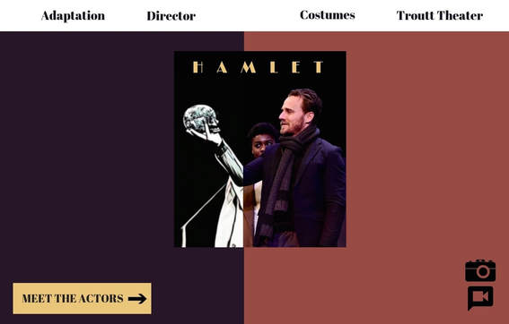 Design Justification
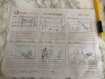
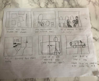
I wanted my logo and web design to be symbolic of the duality represented in Hamlet. As mentioned by professor McDonald, a large component of Hamlet is the divide between who Hamlet is while wearing the mask and who he is without the mask. Rather than simply focusing on the iconic image of the skull, I wanted to spotlight the depth of Hamlet as a character, since this is such a large aspect to the play. In addition to this element, I wanted to portray duality in my design to highlight the "interplay of traditional and new media” (Belmont Folger Shakespeare Grant). I did this by dividing the photo of ‘Hamlet’ from Belmont’s archive into two distinct edits — one being black and white and the other being the current edit of the photo. To highlight the split in Hamlet’s character, I divided the image to further this contrast, as a result of the death of his father (the skull). Although only Belmont and Nashville audiences would recognize the actor in the image, Nashville and global audiences would recognize the symbolic elements of the logo and web page. As for the web design, I wanted to maintain the theme of duality. I did this by splitting two background colors and aligning them to the split in the logo. As for the color scheme of the page, I wanted the colors to tie into the costumes seen in the logo. The content of the webpage is separated into the navigation bar, the ‘Meet The Actors’ button, and the visual icons. I created this proximity to maintain a clean, navigable site, so that viewers could better access a desired page. I also wanted the alignment of the main headings to be consistent with the division of the page. I chose to use icons for the photo and video links to add emphasis to them, as well as highlight that these are visual pages. Overall, I wanted to create a design that’s visually appealing and simple, yet representative of the complex themes and adaptations of Hamlet. 9/26/2018 0 Comments CRAFTING CODEThe Technical: To make this site, I first started by keeping my original Tutorial 2 folder that we turned in awhile ago. I hoped I could edit the code by adding in parts of w3.school templates. However, I soon realized that it’s very difficult to pick and choose from a variety of templates. And, of course, I wanted to make it completely unique. So, I started by making the home page with simply a solid background color. Then, I edited a navigation bar and photo gallery from one of the w3 templates. For other elements, I simply browsed over the stylesheets from other templates and familiarized myself with the codes. Based on what I saw, I would try to translate that into my own stylesheet. This was definitely the most frustrating part because once I figured out the code, it typically never appeared as I wanted it. To fix this, I had to play around with everything else on the page. For me, this was my primary obstacle — adding new elements without changing other content. After time and a lot of frustration, I eventually figured out how to manipulate the elements so that they would compliment each other. The Ideal Website: When I started this process, I didn’t have a distinct “vision” of how I wanted my website to look. After exploring online (and w3 templates), I got a better idea as to what I wanted. I hoped that it would be clean and organized, but also decorative and vibrant. I also knew I wanted my color scheme to be subtle, so that it could contrast other vibrant elements. Overall, I feel like the closest I got to this “vision” was through the color scheme. On the other hand, I wish I could’ve spaced and aligned the elements better. If I knew everything about code, my website would be much more complex visually, through varying alignments and elements. Modes: I feel that I most prominently used the linguistic, visual, and spatial modes. Linguistic: Although I didn’t use a vast amount of words, I feel that when I did, I specifically considered word choice and the organization of words. I wanted the content to look and feel approachable, most importantly. When there are too many words at first glance, the content feels overwhelming and cramped. To avoid this, I tried to be concise as possible, and balance the words with another element on the page. Visual: Visually, I tried to create content that would appeal to the viewer’s eye. I attempted to do this through contrast and alignment. To contrast, I specifically chose colors, fonts, and sizes to distinguish certain items from the rest. However, I also wanted to be consistent with the overall theme of the site. To be visually consistent, I focused on keeping color, font, and alignment the same, for the most part. Spatial: From the start, I wanted my website to be spacious so that it would be easy to navigate, appealing to the eyes, and overall approachable. To do this, I tried to organize each element in a specific proximity to the others. Design Strategies: Two specific design strategies I tried to incorporate were color and contrast. I purposefully chose a lighter background color to contrast the black and white text and the colorful graphics. I hoped that this would bring the viewer’s attention to certain elements. Overall, I wanted the site to be balanced and consistent, but also eye-grabbing and lively. To conclude, this was one of the most challenging tasks I've had this semester. All in all, I do feel like I learned another language, even though I'm not fluent in the slightest. It was satisfying to see how far I've come though.
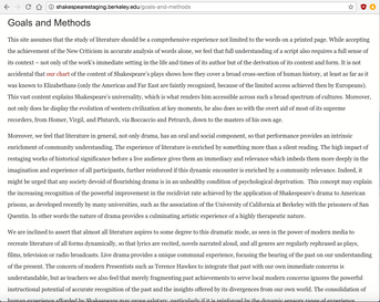
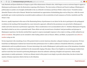
9/18/2018 4 Comments A Rhetorical analysisShakespeare’s Staging — a digital archive developed by Hugh Richmond, containing materials from his time with the Berkeley Shakespeare Program. Overall, I feel that a few more effective rhetorical and design choices could be made, particularly on the home page, considering that it is an important attention-grabber for any website. However, the overall organization of material seems to be fairly formulated and navigable. AUDIENCE. Their intended audience is to appeal to students and teachers, as referenced in the emphasized header under the website’s title. However, in the body, it claims that this is a resource for all “Shakespeareans,” meaning anyone with a love of Shakespeare, including “students, scholars, teachers, performers, producers, and general audiences.” This opens the .door to a wide audience, meaning anyone who’s interested; however, under the first tab ‘How To Use This Site,’ the options are solely divided into students, teachers, and researchers. 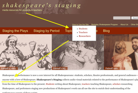 There is definitely more than one intended audience for this site, as noted in the body, so I think they should keep the website options consistent with this claim. If I were simply a “lover of Shakespeare,” I could feel intimidated by this archive upon first glance, if I feel I cannot fit into the student, teacher, or researcher categories. PURPOSE AND GENRE. As for the large-scale purpose of the site, the home page states that the mission is to enrich an understanding of the performance aspects of Shakespeare’s scripts for anyone who’s interested. As noted, this is provided by a collection of audio-visual materials from Shakespeare’s plays at the time of Shakespeare through present times. This explains their mission fairly well. However, under the ‘Goals and Methods’ tab, they explain many more motives of the site. As a viewer, this page seems a little redundant, involving only text, little space, and no visuals. Also, I feel that the information could be more concise. I would be more likely to read about the other goals and methods if it felt easier to read and more approachable.
Upon first glance, this page seems more like a Wikipedia page to me, rather than a compilation of goals and methods. For the viewer’s sake, I would simplify the content and the layout of this page. CONTEXT. The site offers texts categorized by plays, time periods, and topics with a wide variety. Readers will familiarize themselves with the content by reading, viewing images and slideshows, as well as watching videos. The organization of the content is specific to certain aspects of performance, which I think allows the reader to navigate more personally and effectively. AUTHOR. As listed under ‘About Us,’ the site was developed by Hugh Richmond. However, there is also an entire page devoted to Hugh Richmond, containing his biography, publications, awards, references, articles, and archival collection. This allows us as readers to establish credibility with the author, especially since we are provided lengthy and detailed information about him, as well as links to further investigate. In addition to Hugh Richmond, we are provided another page called ‘Site Personnel’ that gives us a breakdown of every person involved with a brief description (i.e. site coordinator, site builder, associate director, assistants, and consultants). As a reader, I feel that this allows me to trust the developers of this site. DESIGN. The home page places a large emphasis on the categories of staging, specifically by play, time period, and topic. They display them on a red ribbon in a large, yellow font. I think this was an effective design choice because it helps the viewer see their options and find their topic of choice more efficiently. I personally wouldn’t have chosen a yellow font color for readability sake, but it does lighten the page in accordance to the brown and dark red. I would suggest updating the color scheme in general to a brighter, more clean aesthetic. Particularly for the smaller navigation bar (About Us, How To Use This Site, etc.,), I feel that the small font size and the yellow color works against each other. I would rethink the layout of the two back-to-back, horizontal navigation bars. 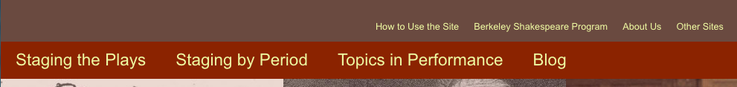 There needs to be a larger contrast between these two elements, since they are crucial to navigating the site. Because they are similar and lie close without space, these two bars blend together in our heads. I personally didn’t take time to notice the smaller navigation bar upon first glance. Although there was a lack of contrast and a space, the photos were a nice visual that helped break up the redundancy of the information on the home page.
HOW CAN THIS HELP US? Overall, I think developers of any website should strive to develop a manageable and approachable site. This website in particular would feel much more approachable if it incorporated more space between elements, larger contrasts, and more concise information. In addition, I think the color scheme should be largely considered. This site’s color scheme was consistent, which was effective, but overall needed more contrast to cater to the reader’s eye. This is a useful reminder for us, that when we create our performance archive, we need to consider how colors, typography, font, positioning, and alignment all work to create a contrast that insinuates the most important information. LINK: Shakespeare’s Staging. Dir. Hugh Macrae Richmond. University of California Berkley. < http://shakespearestaging.berkeley.edu/>. 8/28/2018 1 Comment A CURATION OF SORTSIn a world of followers, requests, tags, and hashtags, it’s evident that we as humans need connection, no pun intended. But, in order to connect with anyone digitally, we must first create a desirable identity for ourselves. For me, this dates back to third grade when I was choosing a username for my aim account, which resulted in the unfortunate, “coconutchick9.” Nonetheless, somewhere in my third grade mind, I was doing the same thing that I do today when I choose an Instagram caption: creating something that represents how I want others to see me. Today, I only “represent myself” or “create an online presence” through Instagram, Pinterest, and Spotify. However, both my Pinterest and Spotify are used simply for myself — basically to consciously organize and keep up with all the things I love, whether that be an album or a good recipe. So, my involvement in these two platforms are sporadic and honestly just convenient for me. As for Instagram, I feel like this is the technology that I more intentionally create “an online presence” for. Although, this doesn’t say very much considering I post a few times a year. When I do post, I feel that I do it to simply share personal events with friends and family. Although I do appreciate an “aesthetic” looking Instagram account, I personally don’t strive to create this. Since I’m a ghost on every other technology, Instagram, for me, is a means to connect with others who I don’t necessarily see everyday. With this being said, I tend to limit my posts to monumental things or events that are worth seeing. So, my online presence on Instagram is a curation of these things, one way or another. Obviously, I am not an overly conscious person on social media technologies. However, I do find it entertaining and a good means of connection, communication, and organization in my case. On a less personal note, I do have a “professional” website to showcase my writing and resumes (created in Professional Writing course). This, unlike the other technologies I use, involved particular selection and strategic representation. I carefully picked my theme, color scheme, font, etc., to create an online presence that would be desired by employers. This technology requires less involvement from me on a daily basis; however, it also requires a more conscious digital curation. Below you will find some pages from my "professional" platform of technology (as you can see the similarities between this and that one). I like to keep things simple, clearly. Dani Jackson |
|||||
 RSS Feed
